A Colour Notation By A H Munsell : In a Nutshell
An interesting conversation between me and my friend just after visiting an art gallery:
Me: Why do you call this beautiful ?
Friend: Colours are different. With a pause he says, “ Colours are vibrant.”
Me: What do you mean by vibrant ?
Friend: I mean tone is nice.
Me: Tone !
Friend: Yes tone. I mean the amplitude.
Me: Amplitude!!
Friend: Okay, the light of the colour.
Me: Oh, you mean to say Value of the colour.
Friend: No. Quality of Colour.
Me: You mean Chroma of the colour?
Friend: Oof! I don’t know. I have liked the colour. I have liked the design. That is it. Period.
He left angrily. I was observing the rhythm, pattern, and scale of his anger. All these are musical terms. Actually, I was observing the value of red, yellow, or blue reflecting on his anger. In this conversation we were discussing about colour using musical terms, but to interact correctly we need a different approach.
In our day to day life Colour is an integral part. From Household to Professionals it has become a necessity. For a Sweet shop owner, colour is as important as it would be for an Interior designer. A creative professional carries out his conversations with the clients in their own terminology. Even a soil scientist uses the colour of a soil sample for his research. Colour has always been an integral factor while purchasing household items such as furniture, utensils, cushion, toiletry fittings etc. Mostly we speak about colour in layman terms except professionals. Even in our childhood, we are taught about basic primary colour and secondary colour i.e. VIBGYOR. Even growing up, we tend to use terms like aquamarine, sky blue, topaz yellow.
So, to represent these colour variations having a system in place that can help us express innumerable colour variations with some logical expression would be really helpful. One such system, is colour notation. Like musical notation, we can discuss and express colours through colour notation.
Munsell Colour Notation:
In the nineteenth century, there was no colour notation. So to describe our interior decoration we would need to talk like a layman i.e. Mauve colour, Turkish Blue, Marigold Yellow, Varnish colour, Berry Colour. The scenario has changed now in the 21st century. An artist and Educator Mr Alfred Henry Munsell is the one who had created the notation of Colour. It was he who published “A Color Notation” in 1905, and in the year 1915, he published “The Munsell Atlas of Color”. He was the man who standardised fundamentals of today’s colour system which is considered as Munsell Colour Theory. We often utter nowadays Hue, Value, Chroma which have become the scale to measure colour. Hue is the pigment. Value is Lightness or Darkness. Chroma is saturation or sharpness or strength of that hue. Some people refer to Chroma as spectral quality.
( Published in 1905 )
Few Applications of Colour Notation:
This colour system has varied applications for many professionals in several fields.
* A Soil Scientist: Makes a note on soil colour sample and change in the quality of the soil.
* An Artist or an Interior Designer: Uses colour notation to match the colour or recreate the colour. This system also helps Fabric Companies.
* A Shoe Maker: Organises the QC expert to instruct and design a shoe matching with the sample.
* A food Scientist: Brings custom colour to create the flavour of a certain food.
* Horticulturist: Predicts tentative characters of a leaf based on its colour.
Munsell Colour System:
Colour is applicable to various parts of our life and to represent it specifically we need notation. In Music, we have notation i.e. pitch, velocity, duration. Through these, we can write endless variations of music. But in the case of colour, we are using tone, key, and note etc. These are musical words and Munsell’s success lies there. He introduced notation to explain colour. He organised the three-dimensional colour theory which is now called as solid colour notation. Another way to show colour is through Colour Atlas or Colour Tree.
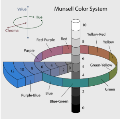
This picture is taken from www.munssel.com
In this picture above you can observe the vertical line which is the Value, black to white. The Circle is the equator of a globe, which is Hue or pure colour. The other axis perpendicular to Value is Chroma, representing the sharpness or quality or strength of colour. The south pole is black, and the north pole is white. The parallel layers above the equator are lighter, and below are darker. The vertical axis joining Black and White is the neutral scale of grey values.
So if one would express Colour Notation Yellow  . It would mean that Hue is pure yellow, Value is 5 or in equator (Vertical Axis), and Chroma is 6 i.e. perpendicular to Value axis. Suppose a Fashion Designer wants to write a notation and he says - It is a combination of Green, Green-yellow, and Red-purple. The Green is lighter, Green-yellow is darker and Red-Purple is in between. It means Value of Green will be higher than Green-Yellow. The Value of Red-Purple is higher than Green-yellow but lower to Green. Now he has to mention the Chroma or Colour strength or quality. We can write Notation as below:
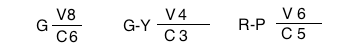
Here G is Hue, V is Value, and C is Chroma. So the value of green is 8 and chroma is 6. Similarly, for G-Y (Green-Yellow) the value is 4 and chroma is 3. The last one i.e. for R-P(Red-Purple), value is 6 and chroma is 5 respectively.
Colour Notation and Kids:
Beauty of colour can be perceived, not sensed. To express harmony of colour you need the colour notation. While conducting a study about a butterfly, bird, flower, tile, or personal choice of colour pair or colour triad, a notation is important. It is balanced by H, V, C.
A colourist can express more scientifically about the balance of colour through colour notation. With measured notation he can talk about balance of colour. Artists and professionals are aware about balance of colour which is a preservation of subtle balance, not extremes. These are all utilization of colour within the colour sphere. Anything out of this sphere breaks the construction in balance of colour. Though there is no fundamental law related to colour harmony, but Colour notation can be helpful to inform our kids scientifically. Moving forward, we can train our kids through colour notation so that they can become better at expressing colour.
Comments